ELEVENTH POST - March 10th, 2009, 8:44 pm Queen Impressions: -Genuinely confused when things aren't going her way, a little clueless. It's not so much that she wants something because she selfish but because she just assumes she can have (or already "owns") whatever she wants. -Kindof a mix between Gracie Allen - comedically clueless, Audrey Hepburn - fashionable and sophisticated, and Mrs. Cleaver - Kindof a weird mother in the sense that she believes she is in charge of everything...random but I'll try to find a better example. -Believes that she is in charge of the universe, I guess nobody else got the memo ;) -So she looks down on everyone and assumes she is the leader but isn't actively dominating I guess, does that work? I really didn't want her to be the cliche "off with everybodies heads" dominator queen, more of a "why won't this thing stop talking, make it go away" perplexed and delusional queen. Maybe she's from another planet where they all have social delusions ;) The pose: I think the idea of her looking down shows her superiority. The hand is on the hip, ready to inspect everyone else and pass judgment - it also reminds me of a mother reprimanding her child or waiting to hear what mischief they got into. The legs are floating but she's still pulling one in like she doesn't want to touch something "lower" than her. The idea of her floating also works with the fact that though she meddles in everyone else's business but she isn't actively involving herself in it. She's not "grounded". Essentially she wants (believes it's her duty) to tell everyone what to do but she shies away from involving herself with those lower than her and things that are foreign to her. Looking at the Costume sheet, I think I could make her narrow her eyes a bit to make it more obvious that she's looking down, furrow her brows and purse a lips a bit to show a bit of confusion or adorable frustration?. I want her to look a little more like the "girl you could never get", the untouchable beautiful girl in school. I'm having a hard time communicating her personality through the outfit but I'll try to work out my first impressions one by one and see what I come up with...: #1- the "heart" design on the bodice was my first idea for her, it's a 60's shape and I think it's feminine. The high neck adds a bit of sophistication. I added the design on the legs to emphasize the hips as well as slim them (the line down the middle breaks the hip up but the shapes created on the outside would also widen them) I think the lines on the gloves and boots add "spaceyness" but might be too busy. #2 - to me this one is uber feminine, and seems to make her a little younger. Maybe too young though. I was hinting at the heart shape again with the design on the top of the hip, and in the gloves and boots. I think she looks too nice... #3 - the crossing v-neck is a little too sexy for her now that I think about it, she should be beautiful but not so inviting. The line on the legs is drawing my eye in a weird way, I'm not liking them so much. (they kindof remind me of the lines on some animal's legs) #4 - I like the way her hair thing draws the eye in this one, the repeated design on the neck seems to frame her face in a nice way...I like that the design is repeated on the hips but I don't know if it was the best way to do it. Overall It seems almost right but I don't know...the legs are looking to clunky and heavy - they take away from the face. #5 - The simple headband looks nice, young but sophisticated. This is only a slight variation from the #1 but I think the simplifications work a little better. I still like the heart bodice but I'm not sure if it fits the character as well as the clean turtleneck like in #4, it does allow the eye to wander more on the figure but I like the idea of focusing on the face. #6 - This one gives off a very "ready for adventure" vibe, I like it as a design but I don't think it really fits the character or story line. I like the lines on the boots though. #7 - I like the repeated design on the gloves on this one, the hair thing looks ok too but I think the jumper design on the top and hips is making her look too young and motherly (like an apron), I really think the design on the gloves and in the hair have some possibilities though... #8 - Super simple. I think she looks like part of a group, like one of many that would have a similar design. It's nice and clean but I want her to look more individual. The lines on the boots remind me too much of mallards... # 9 - Based on a dress I own ;) I think it's cool how the hair piece is wrapping around, combined with the neck design it's framing her face but allowing your eye to take it all in. I looks a little "mechanic"-y though, the costume combined with the pose comes across as a "ok I'm here, what needs fixing" It's not really coming off as a main character but I think it allows the best eye movement of all of them. #10 - I really liked the leg design but after working out her character I think it would suit a more dominating personality. Likewise the zip-up neck, while sophisticated, seems way too sexy for her character. It's just too much on the whole. #11 - I was watching the tron trailer, forgive me ;) It kindof works but the circles on the leg bring the eye in at a weird point, my eye locks into the hips and I don't like that. I'm not sure what I feel about the hair and neck. I don't know, this one is interesting but I can't pin down what it makes me feel - maybe that's the problem... After all this...I'm still liking the turtleneck idea - it's more "untouchable", maybe the repeated designs on the gloves and hair of #7...hmm... Sorry if that description was spastic, I was having a hard time sorting my thoughts, I don't know if the dynamic will really even work but those were my first thoughts. I think she would still be powerful in the sense that she has huge resources at her disposal but she would just use them in bizarre ways - like the queen in the actual book. JASON: that is some great thinking. see how it helps to vocalize (or write down) your character and talk through your ideas? you have a lot of good critiques on your work - as for detail and ideas - I suggest you check out Sean Galloway's work - http://gotcheeks.blogspot.com/ - I think it will help. Not everything he does is gold - but most of it is pretty dang phenomenal. I liked your "mallard" comment - and agree. as far as "untouchable" - when I think "untouchable beauty" like you're saying here - I don't think "skanky" - showing too much but alluring, certainly. and that can be achieved in so many ways other than showing skin. - in the end - it's your call. but the "untouchable" quality (to me) is more of nose up, aloof expression - not making eye contact. maybe half-closed eye-lids or all closed - give it a shot, I don't know. the only think I would say to change about the basic figure is the right foot. if on the ground this would be pigeon toed and shy - but in the sky she's got a broken foot. it needs to go the other direction. - just try it yourself and see how it feels. . . unless you have a broken foot (in which case, I'd feel terrible) - and you'd need to get some reference - or I'll do a sketch for you. so - good job. now fix that foot and come up with a few more variations - ones that fit - and post those up. I'm excited to see what you put up next. |
Tuesday, October 4, 2011

TENTH POST - March 10th, 2009, 3:28 am
Got distracted by CHOW (Character of the week) and forgot to post this, here ya go :)
Got distracted by CHOW (Character of the week) and forgot to post this, here ya go :)
- Thanks for the great crit btw! ^^ I'll work on her a bit more, I think if I have a better idea of the Queen's design it should help me with the details on Alice's costume as well so have at it ;) (I'm liking the legs on #10 right now)

JASON:
Hawk - I want you to tell me what you like about these costumes. tell me about the character how these costumes/pose/expression help express her. Remember - we see the character - it's made up of what we do - which comes from what we think. so give me some background on the character and what she's like. talk about the costumes in terms of contrast, flow, interest, idea, concept, leading the eye, stopping the eye, speed, repetition, etc. tell me what ones work and what ones don't in your opinion. A lot of times it helps just to verbilize what you're looking at. go through each one. I'll give you a critique after you present it yourself. This realy helps. A lot of times I'll see stuff when I'm talking about pieces.
these look good - I'm looking forward to your explanation.
NINTH POST - February 24th, 2009, 4:02 am

Here's some more Alice, I'll post the King and Queen tomorrow...I need to sleep...

JASON:
#1 - there's something really simple and beautiful about this. the torso is clean and really strong. I also want to see a line or shape on the gloves and boots.
#2 - I love the line continuing on the leg. the shape on the glove gives variety and I want to see that repeated on the boots.
#3 - the skirt - not as strong as the previous ones - but the shape on the boots is good
#4 - the goggles are great. seem a little unnecissary with the helmet and the band with the one circle is just such a nice shape i'd hate to lose it. the costume is nice
#5 the design on the gloves - this is great! repeat it on the boots and you got something
#6 - those two lines are nice on the skirt - repeat it on the gloves and boots and it'd be stronger than the squares, I think. I'm not sure how I feel about the lines on the wings - could be amazing - try the lines on the gloves and boots, too - something might be overkill - wont know until you try it.
good job. keep it up.
EIGHTH POST - February 19th, 2009, 9:48 pm

JASON:
Hawk - glad to see you're back. and . . . . bring it on.
that's a really great page of expressions. clean it up (tighter line work) and you've got something


SEVENTH POST - October 23rd, 2008, 3:16 am
thanks for the awesome critiques guys ^^ So after checking out what you both said and looking over the ships again I admit I'm still not attached to any of the ideas. Going back to my original concept I wanted to make the ship kinda like KIT, so it could drive itself and interact with the passenger rather than just be driven (probably as the voice of reason in the story) so I tried exploring the talking ship idea more and I did a couple of sketches. What do you think? Better? Worse? I'll keep working on this but I think I'd like to follow this concept further and make a page of variations on this idea.
I think I could play with "expressions" in the energy line thing too.
jason01
-The back seat is for the cheshire ^^
pepps
-I do everything in photoshop with a tablet and I usually leave everything really sketchy but I'm trying to make an extreme effort to clean up these assignments since I wanted them to be more presentable and clear. As for my technique in doing that, I'm just improvising as I go :)
-I'd love to see some of your progress, even if you just post it in your sketchbook and link it back here :) Thanks again for the great critique!


JASON:
I like the sound wave things, it's a great idea. and between the rabbit ears - just explore what that will look like. One more thing - the exhaust pipe is too much of a circle. it would be more of an elipse. take something circular (a pencil with some rubberbands on it, a cup, the backend of a highlighter) and hold it in front of you at that angle. I think that will help you with the elipses - showing you what it would look like.
your other elipses are great - except for that line (is that a shadow?) under the belt of the ship. it doesn't help the form. it flattens it.
Monday, October 3, 2011
SIXTH POST - October 23rd, 2008, 5:46 am


*sigh* After working on this ship all week, hacking away and fixing and refixing the interior panel to death I decided to take it back down to the basics and just try and figure out what the main control unit would look like/what general shape would work best (I'll add the extra controls back in when I have this figured out)...I'm really floundering with this one so the sketches are really random/not too inspired but hopefully you can head me off in the right direction so I can start working on a good set of focused variations.
I did work on a turn around of the chair design as well as a set of control sketches but I thought I should clean up and post these first so I could start being productive again. Oh, and as for alice I'm going to make a few variations of the modified #8 and #9.
-I apologize for the serious lack of creativity...I need sleep...

PEPPS:
uhm...i actually think you have explored quite a number of possible solutions, i´m talking not only about design, but also the way the ship should be "driven" by the pilot. I think they all have a simple, old fashioned kind of feel, wich i think suits perfectly the style. i don´t like 10, maybe cause it looks too sharp, and it´s also maybe too technologically advanced. I really like nr 2, maybe if they where of 3 differen sizes (maybe they are already, even if i think it´s only becase of perspective) it would probably look better though. I also like 3...maybe cause it looks like a tv, and it feels pretty uncommon to have a tv there, so it adds a nice touch, ..to me at least it feels cool =) I don´t really like the joystick idea, it doesn´t feel too characteristic, not compared to the other ideas, wich i think are really great. Number 9 for example if i understand it correctly (i see it sunk into the command panel) looks really new as a concept, but not technologically advanced, maybe it would be hard to use but still, it´s a very interesting concept to me. i like 8 a 5 for the same reason as 3, they are unexpected but still make sense, and the moped handles are really very old fashioned as a driving device in a space ship i gues....uhmm
hope it helps in some way.
i´m also alive and working but i´m having a hard time understanding my characters without a story, so i´m trying some story ideas, some character ideas, some silhouettes, when i have a strong lineup ready i´ll update it, or do you want me to post some prgresses meanwhile?
HAWK - i think your presentations look always very nice, your lines are clean and the concept is clear. do you ink with a tablet, or do you use paths?, for this ship for example (i imagine u used just the tablet for the others) and do you use ps/painter, or inkscaped for inking? (clear lines are something i´m strugling with, they seem to take a lot of time to get them right.., thanks =)
cheers!
JASON:
nice
hawk - good job - this is some good exploration. if you're going for clean, 7 is the way to go - most of them I think are too simple - they can be a flat panel - but when we look up close - they could be broken up into color section - a large touch screen - how 60s future is that?!
about your exhaust pipe - the circle in the inside is too high - and too much of a circle - it's continuing that elipse made by the things on the the outside. for screens and things - I adjusted #9 - I don't if it's better - but it is busy. I like the rabbit ears of #8. doesn't have to be a steering wheel - could be a human interfacing device that talks to her. I don't know. you could get rid of it all and just be super clean with touch panels and maybe put up desplays, projected screens, holograms.
I like the detail circumventing the craft ijn #8 and #10. you could also go clean with #3 - I like the transition between craft and exhaust pipe in #2. it shows design - thought - you didn't just shove a pipe in - you had a place where it's been manufactured, fitted, and ready for space travel.
why is there a big seat and a little seat? or am I seeing that wrong.
anyway - good work - keep it up
FIFTH POST - October 15th, 2008, 3:17 am
Midterms are over so I finally get to post these ^^
WHITE RABBIT/SPACESHIP UPDATE
I saw that this week's Industrial Design of the Week was Vehicle Interiors and thought it was too good an opportunity to pass up even though I was already working on Alice. So I'm putting her on hold this week to work on the ship.
ALICE UPDATE
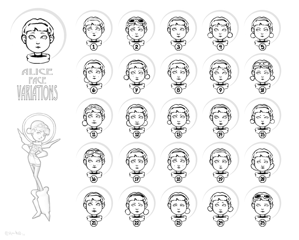
Face Variations - I've always gone with the first face that popped into my head so I thought it would be good practice to instead use my original as a base and see if I could come up with something more interesting by changing it around. The variations aren't too extreme but I think I found a few nice combinations.
Costumes - I figured I'd choose one of these to create variations from. Right now I'm leaning towards the jumper shorts look, especially in #1 and #6 - I like how they remind me of the classic alice apron ^^
Anyway, I thought I'd just give you something to look over while I work on the ship this week - As always, I look forward to hearing from you :)


JASON:
these are great. the controls on the spaceship - a little rough for your style - and the exhaust pipe seemed off center - but i like where it's headed.
the faces - too similar - you need to push it - try drastically different eyes and mouths and noses and relationships of those - you may find one better than you have - maybe not. but it will be educational and it will make for a stronger portfolio piece.
the full body - the helmet looks not like a helmet - just use one line. I've put stars by the ones I like a lot. the shorts just look weird to me. I don't know. I like the full suit or the dress or long shirt or what ever that is. it's very 60s, though - and I like it. I took the liberty of making a few changes - #8 is you #10 with #11's goggles - #9 is you 10s body - with the suit turned to skirt- which I think works nicely. and # 11 is a classic 60's number.
the goggles/glasses add an adventurous flare.
for the most part - these are really amazing.


PEPPS:
hey, they´re really looking good, i liked number 9 a lot,, i think that in general the short take a way some of the female feeling...while the skirt and the suit add that flavour. at the beginning i didn´t understant she had a helmet...so i guess one line works better for that purpose =).
but they look very nice, and very professional!! :)
Subscribe to:
Posts (Atom)